Civic pride is a powerful tool and can help cities overcome great obstacles. When the residents of a city and a metropolitan area feel this sense of pride they’re more willing to make sacrifices or go the extra mile to improve their community. I’ve discussed this idea throughout a few posts, but I think it’s a concept that needs to be explored in different ways. I believe how we show ourselves to the outside world is important, as is having a symbol to rally around, which is why I begin with the need for Syracuse to change its city flag.
Most people reading this may not even realize that the city of Syracuse has a flag to begin with. You’re only likely to find it flying in front of city offices, and even then it doesn’t stand out. It may seem strange to focus on a flag that few people recognize, but that is at the heart of the problem. There are no unifying symbols within our community for civic pride. The closest thing we have as a city is the logo for Syracuse University. To understand what a flag can mean and symbolize, there is a wonderful Ted Talk about what makes a great city flag. Chicago’s city flag is a great example and is showcased throughout the video.


The video goes through five major principles of how to design a flag:
Keep it simple
Use meaningful symbolism
Use 2-3 basic colors
No lettering or seals
Be distinctive (or related)
Now you can see how Chicago’s flag follows these principles, and how Syracuse’s flag does not. While it’s simple and only uses a couple colors, our city’s seal makes it impossible to visually understand from a distance and blends in with any other seal we may see.
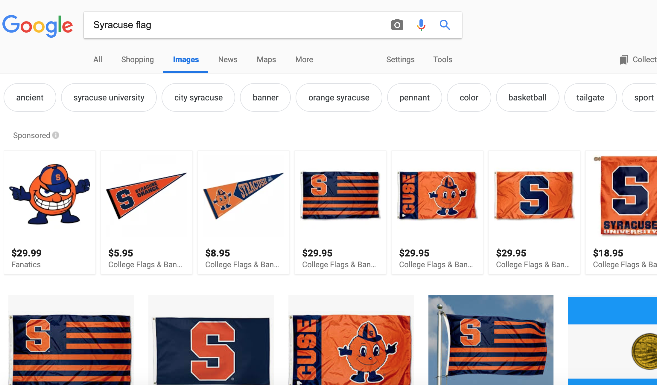
If you look at the Google searches for each city’s flag you notice how prominent Chicago’s flag is, not just in the city but to anyone searching for the city. Syracuse, on the other hand, is dominated by Syracuse University. The city itself is an afterthought with only one image result. While I think we should be proud of the university that bears our name, we should be able to stand on our own and have pride in the city itself.
Above I have a quick rendering that I made of what an alternative flag for Syracuse may be:
Blue Line: the Erie Canal
Top White Line: Snow
Bottom White Line: Salt mining
Orange Arrow: Center of the state/ major stop on the underground railroad for slaves heading north
This is just one idea, and I believe it should open up the conversation to the city for us to decide how we want our city symbolized. I used orange and blue since those have become the unofficial colors of our city and there’s no reason to fight that. I think we deserve to have a better city flag, one that we’re proud to fly on our homes, have hats emblazoned with it, or bumper stickers on our cars.
At the same time, our flag is only one way in which people recognize a city. Another important aspect is how we are seen online.
When you’re researching a restaurant or business, often times your first impression comes from their website. If they have a sleek layout, easy navigation, videos, etc., you’re likely to have a better impression of that business. You’re likely to trust the quality of their product. The same holds true for cities.


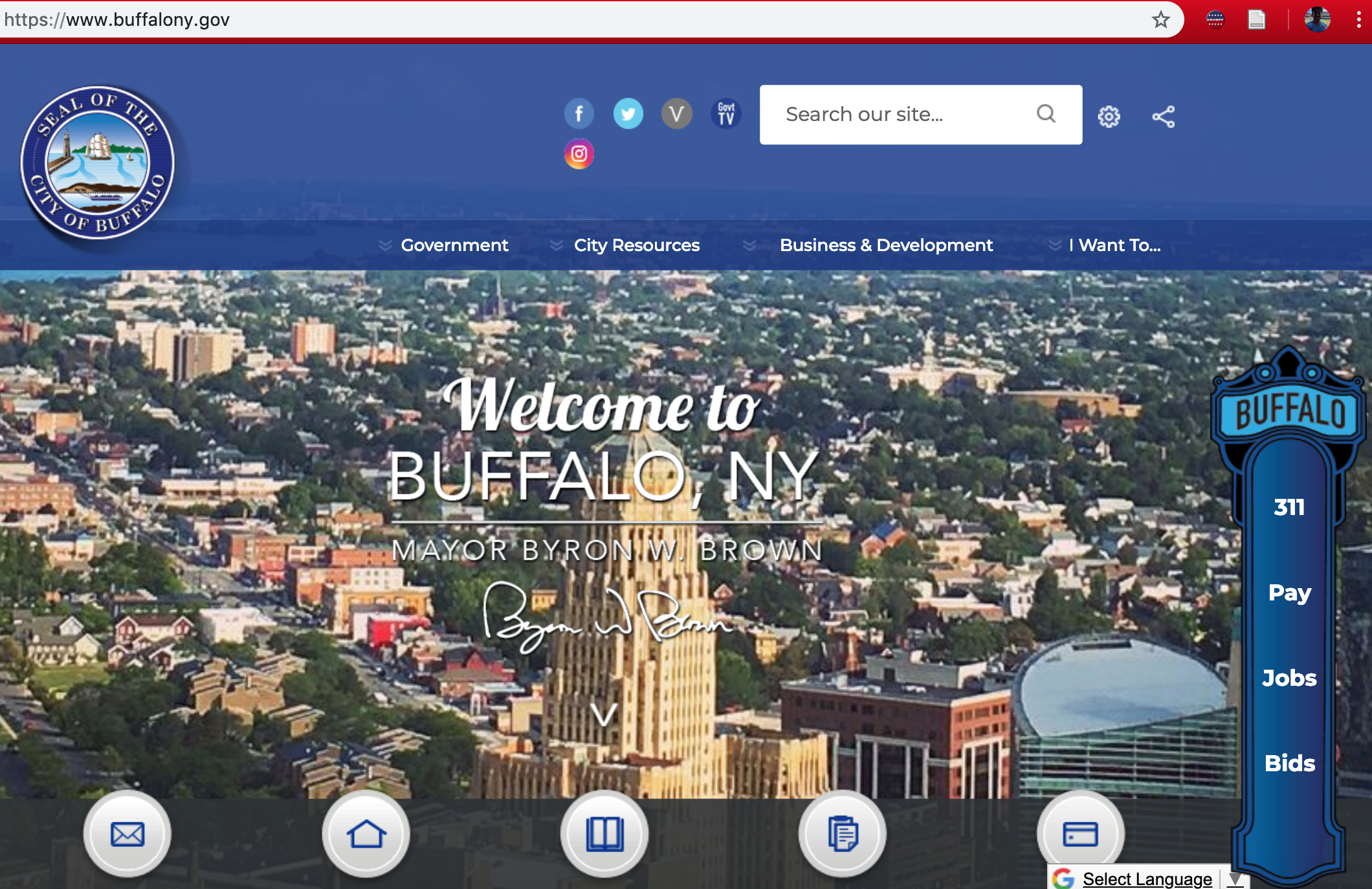
Above is a selection of city/county websites from across the country. Some, like NYC and Los Angeles, you’d expect to have sleek, easy to use websites. Then there are some like Camden, NJ and Buffalo that have spent time reworking their images and understand that their websites are their first impressions to many. Camden has been working especially hard to revitalize their image along with their dramatic restructuring of their police department which has seen huge improvements in safety. They understand that they have to reintroduce people to their city.
Then there is the Syracuse website which is clunky and dated. The website states that a new website is coming soon, which is long overdue, but I hope they are taking cues from some of the most successful cities in our country in how to present ourselves as a modern city.
Take NYC: their city logo is modern, bold, but simple. We should be embracing our initials, using SYR more often. The Syracuse Airport has embraced this idea with their new logo and the city should follow suit, making an interchangeable symbol that we can alter to embrace every individual department.

Syracuse Airport logo
Sadly we don’t have such an easy symbol to embrace like the Buffalo buffalo. They have made that symbol so universal throughout the city, with every sports team having its own version. Syracuse doesn’t have that singular figure, but there’s no reason SYR cannot become more prevalent in our city.
In the end these are not ground breaking ideas, but it’s a conversation about how we want our city to be presented to the rest of the world. Let’s give ourselves an identity beyond the university. The first thing you see when you search for Syracuse should be the city itself and our flag, not a private institution, no matter how closely its tied to the city. But most of all, let’s stop being our own biggest critic and start becoming our own biggest fan. How we feel about ourselves shapes what the world thinks of us.
For further reading on civic pride in mid-sized cities, avoiding our city becoming a clone of other cities, and more city flags, I recommend reading the following:
I also recommend the book “The Next American City” by Mick Cornett. Out of all mayors, he understands what it means for a city to have pride in itself and what that can do to transform it.